Extracting Data from Hand-Drawn 1970 NASA Charts with Claude Fable
I needed numbers that exist only as a hand-drawn curve in a fifty-year-old Apollo report. The manual digitizers didn't scale and the automatic ones choke on annotation arrows — so Claude Fable, Anthropic's newest model, wrote its own tracer and verified it by looking at its own output.
I’ve been doing most of my engineering work lately through Claude Code running Claude Fable, Anthropic’s newest model — and the thing that keeps surprising me about Fable isn’t the code it writes, it’s the chores I’d always assumed needed human eyes and human patience. This is one of those: pulling numeric data out of a fifty-year-old, hand-drawn NASA chart. It worked — Fable built its own tool and looked at its own output until it got it right.
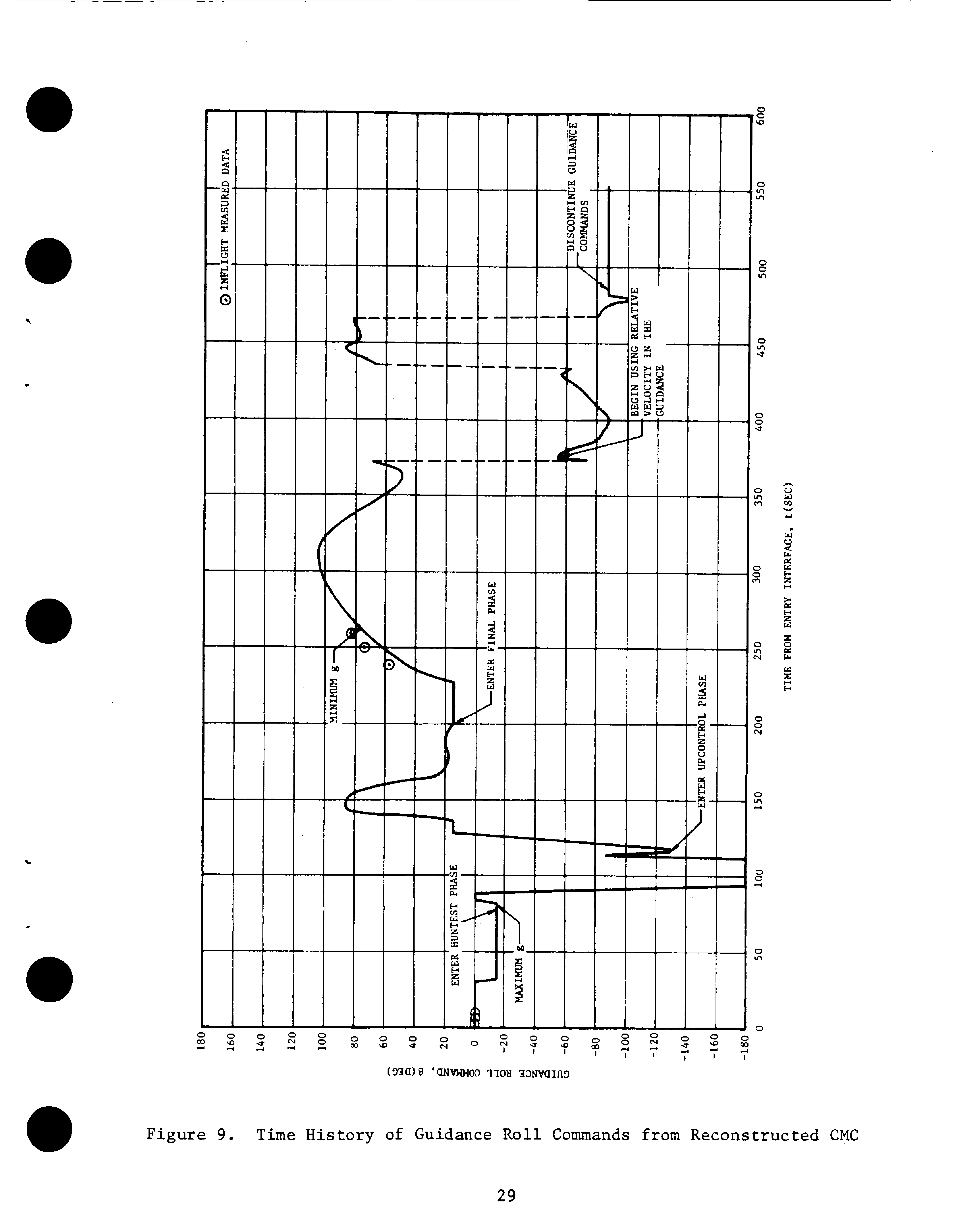
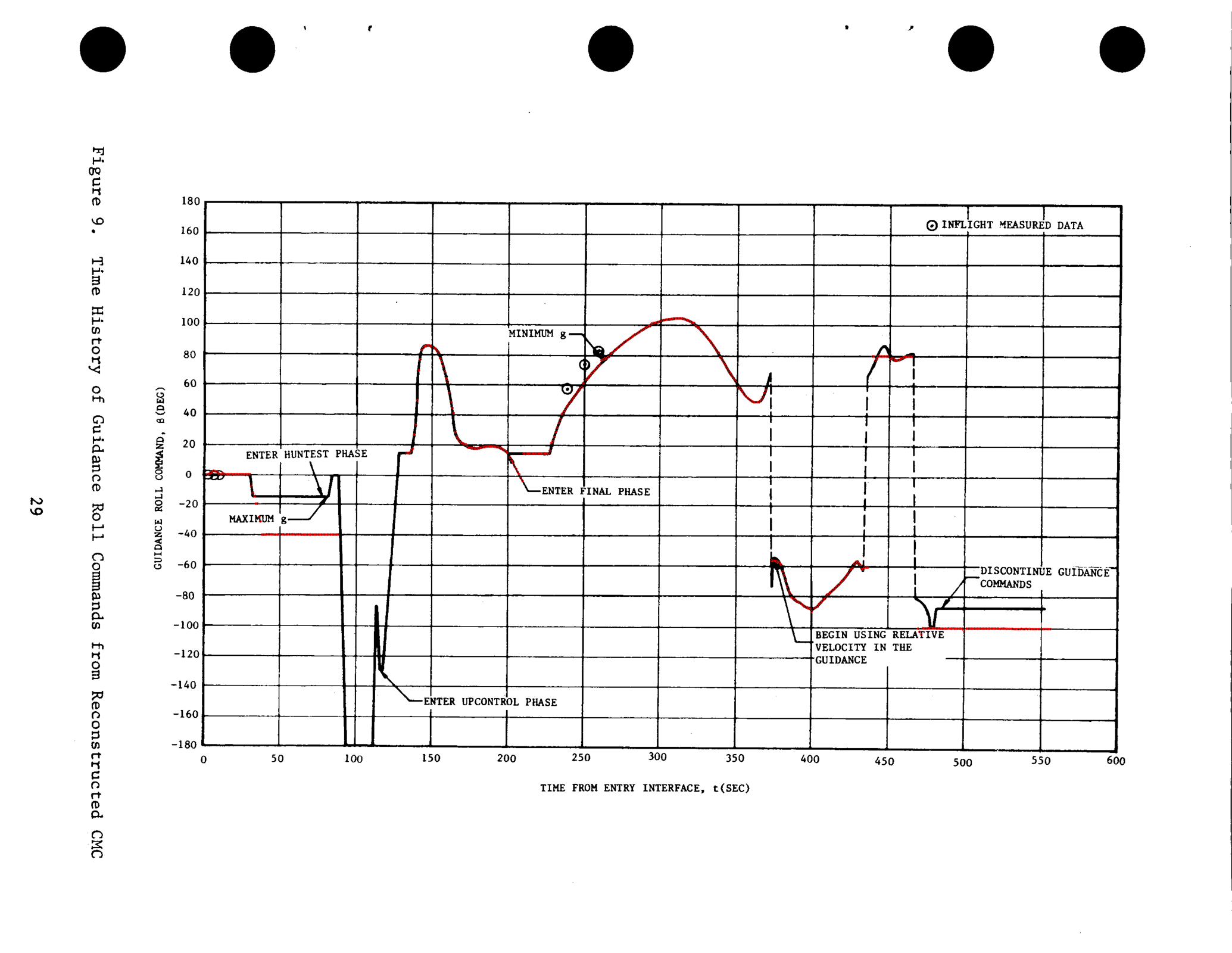
The chart is buried on page 29 of R. H. Manders’ Apollo 11 Entry Postflight Analysis (NASA, 1970): Figure 9, the roll commands Apollo 11’s guidance computer issued during its nine minutes of atmospheric reentry — every bank maneuver the capsule actually flew. I needed those numbers for some reentry simulation work I’ll touch on at the end.
The catch: the data was never published as data. The axes are labeled, but the values exist only as the shape of the curve — no table of time-and-angle pairs appears in the report or anywhere else. A draftsman drew the line by hand in 1970, it was scanned decades later at a slight angle, and that drawing is the only surviving record of what the spacecraft did. Here’s the flight in question — the simulated entry corridor across the central Pacific, with the extracted bank commands painted onto the track:
And here is the only place those commands were ever published:
If you want the values, someone has to get them off the picture.
The strange part is that this problem has been solved for decades — just not retroactively. Modern missions publish trajectories through NASA’s NAIF group as SPICE kernels: binary ephemeris files you can query for a spacecraft’s position and velocity at any instant. When the OSIRIS-REx capsule reentered over Utah in 2023, JPL published a kernel tracking it through the whole descent; my simulation samples it directly at every timestep. That’s ground truth now — an API, effectively, for where the vehicle was.
Apollo predates all of it. Its record is prose, tables of single events, and figures like this one. Same quality of measurement, radically different durability of publication.
The options we looked at
WebPlotDigitizer is the standard tool for this: load the image, click a few known points on the axes to calibrate, then click your way along the curve and export CSV. It works. But it’s fifteen-plus minutes of careful clicking per figure — this report has six figures I care about and the companion aerodynamics report has more — and the output is hand clicks nobody can re-derive from the source and check.
Engauge Digitizer (it’s in nixpkgs) advertises automatic curve tracing, which sounded like the answer — but it’s built around its GUI, there’s no real headless mode, and its auto-tracer assumes a clean modern plot.
Which gets to why “automatic” tools generally fail on documents like this: a 1970 NASA chart is drawn in one ink. The data curve, the gridlines, the annotation arrows (“ENTER FINAL PHASE →”), and the typewritten labels are all the same black. Any naive follow-the-dark-pixels tracer will eventually wander off the data and down an arrow — and nothing in the program will notice.
So Fable built one
The program Fable wrote is not exotic — column-by-column curve following, the kind of thing anyone could have written years ago. What made it actually work is that Fable ran a closed loop on its own output: trace the curve, draw the extracted points in red on top of the original scan, look at the image, find where it went wrong, patch, repeat.
First it set up the boring parts without any human clicking:
- Render the PDF page at 600 dpi and rotate it to landscape.
- Self-calibrate the axes from the graph paper itself — sum the ink along each pixel row and column; the gridlines show up as spikes. Fitting all 13 vertical and 19 horizontal gridlines pinned the pixel→seconds and pixel→degrees mapping to within about a quarter second and a quarter degree.
- Mask the gridlines out and follow the curve column by column.
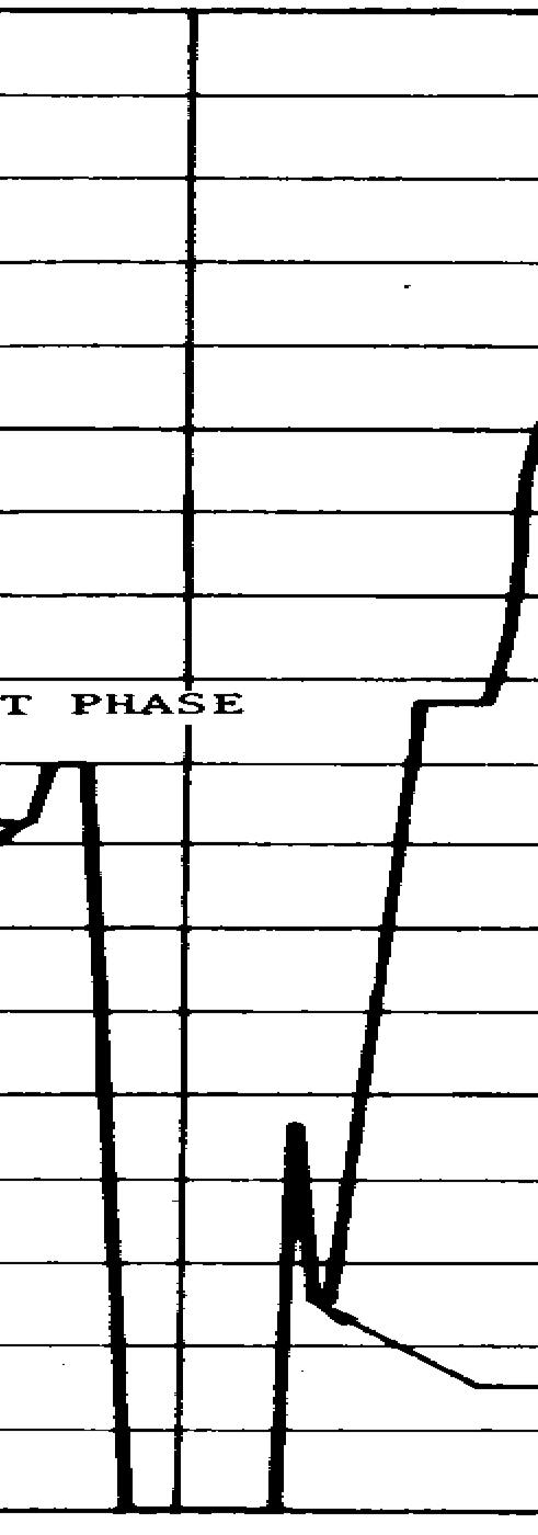
Then came the part where every automatic digitizer dies. First attempt:
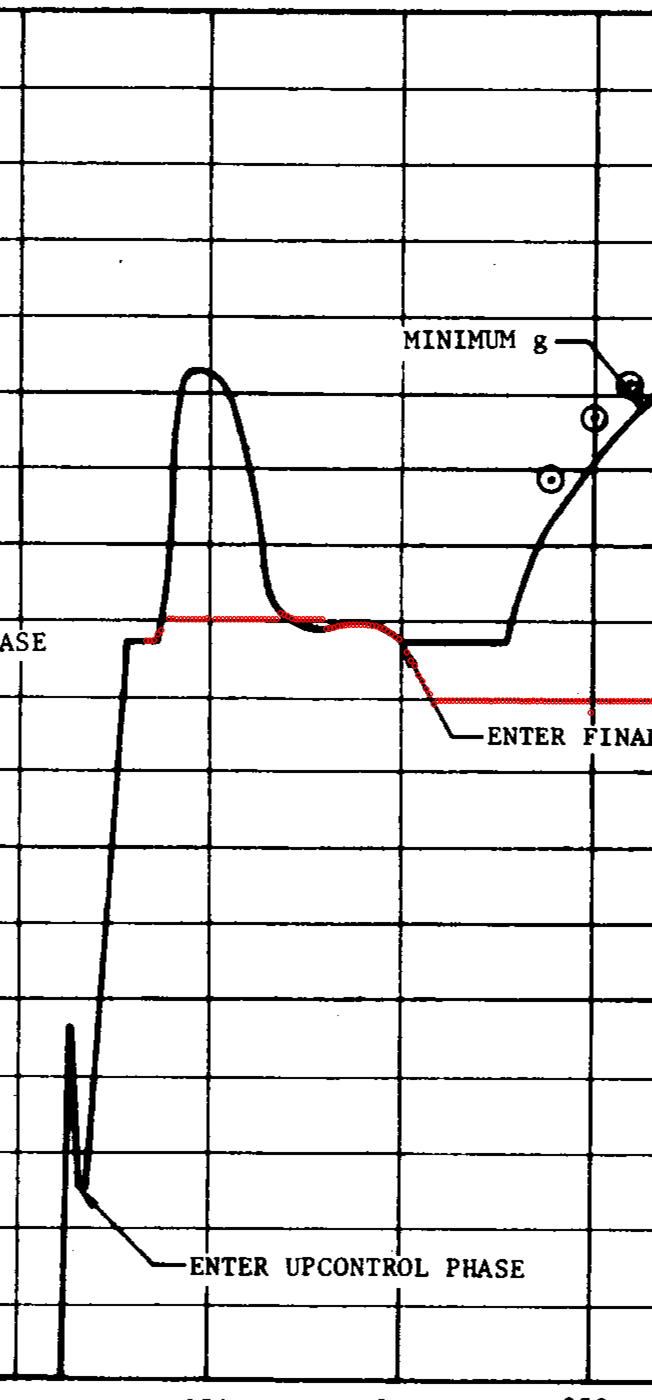
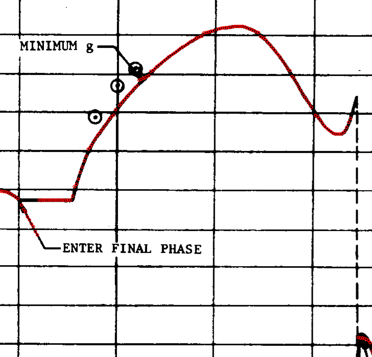
The red trace rides the curve beautifully — then slides down an annotation leader line and ends up tracing the words “ENTER FINAL PHASE”. Here’s where this stops being a normal script: Fable looked at the overlay, named the failure, and noticed what a human squinting at the scan would — the hand-drawn data curve is about three times thicker than the ruled annotation lines. So: prefer thick ink.
That fixed the label dive but not the junction where the leader line touches the curve (same pen, same thickness there). The fix was the kind of cheap trick you only find by staring at the actual image: trace that span of the chart backwards. Approached from the right, the curve runs flat through the junction while the leader departs at an angle, and continuity keeps you on the data.
One region resisted automation entirely — the most violent part of the flight, where the command dives to −180°, rides along the bottom border of the plot (indistinguishable from the axis line), pops back up, and spikes through a maneuver:
For those 47 seconds Fable did exactly what a person with WebPlotDigitizer would do — zoomed in and read the chart — except its “clicks” became 22 transcribed points in the assembly script, with a comment stating the method and a ±3° accuracy estimate. The other 484 of the 506 points came from the tracer.
Three look-and-fix rounds, a few minutes each. The committed artifacts are the CSV, the tracer script, and a note with the calibration residuals — anyone can re-run the extraction from the archived PDF and get the same numbers, the one property manual clicking can never offer.
What it was for, briefly
The simulation work: I’m validating a reentry trajectory propagator against historical missions — fly the simulation from the documented entry point, compare against the documented landing point. Apollo 11 steered itself during entry, so an honest test has to replay the exact roll commands the real capsule flew, open loop, rather than let a simulated autopilot aim for the known splashdown (which grades the controller, not the physics).
My favorite detail: the replay also validated the digitization itself. Apollo’s roll commands alternate left and right so sideways drift cancels. Flying the extracted profile, the landing error came out almost entirely along the flight path — only 14 km sideways over a 2,500 km entry. A misread curve or a flipped sign anywhere would have shattered that cancellation. The flight itself vouched for the chart-reading.
(The along-track error is real and large — it’s measuring my simulator’s crude aerodynamics model, whose real curves are trapped in three more figures of a 1969 report. Same tracer, next weekend.)
Somewhere in NASA’s archives there are thousands more figures like this one — wind-tunnel curves, trajectory reconstructions, telemetry plots — each the only surviving record of measurements that cost millions of 1960s dollars to make. The data was never lost. It’s just been waiting for readers with patience, and patience is exactly what machines are good at.